Benchmark fiction
Industry averages are comfort food for lazy operators


TL;DR: Fit 8 candidate distributions to CVSSF per 1KLoC across 71 organizations. Lognormal wins (KS p=0.85), log-logistic ties it. σ_log ≈ 1.77 means a ~60× spread between the median and the P99. This isn't a quirk of the sample — it's the predicted shape when defect rates are generated by multiplicative processes (Mullen, ISSRE 1998). The post breaks down the five factor families the literature has identified as the multipliers: complexity, churn, developer activity, process maturity, and product attributes. And why reporting means, stdevs, or linear improvement targets on this kind of distribution is statistical malpractice.
A few weeks ago I was looking at a chart with 71 bars. Each bar was a different organization, and the height was the density of open severity per thousand lines of applicable code — the metric we use internally to benchmark how security-debt-laden a codebase really is.
The tallest bar was 1,546. The shortest was 0.1. Same metric, same unit, same methodology. Fifteen thousand times more severity per KLoC in one organization than in another.
My first reaction was the reaction anyone has when they see a bar chart that ugly: these numbers must be wrong. The second reaction, after ten weeks of re-checking the pipeline, was worse: these numbers are right, and I don’t know how to talk about them.
Because if I report the average, I’m lying. The mean of that dataset is 91.8. Exactly one of the 71 organizations is anywhere near 91.8 — the rest are either well below or way above. The mean is an artifact; it describes nobody.
If I report the median, I’m closer to honest — it’s 22. But the median doesn’t tell me why some organizations are at 1,500 and others at 0.1. It just tells me where the middle is.
So I did what you do when the usual summary statistics betray you: I asked what shape this distribution really has. And the answer, it turns out, is not an accident. It’s the only shape this distribution could possibly have, given how software actually gets built.
The fit
After fitting eight candidate distributions against the data — lognormal, Weibull, gamma, exponential, Pareto, power-law, log-logistic, Burr — two of them came out indistinguishable at the top: lognormal and log-logistic. Kolmogorov-Smirnov p-values of 0.85 and 0.98 respectively. The Shapiro-Wilk test on the logarithm of the data gives p = 0.56, which in plain English means: once you take the log, the distribution is statistically Normal.
That’s the definition of lognormal. If log(X) is Normal, then X is lognormal. Parameters: μ_log ≈ 3.06, σ_log ≈ 1.77. Translated: a typical organization sits at around e³·⁰⁶ ≈ 22 CVSSF/KLoC, and the σ in log-scale is so wide that the organization at the 99th percentile has roughly 60× more severity density than the one at the median.
This is not a dataset anomaly. This is the shape severity density has always had, and will keep having, because of the mechanics of how the metric is generated.
Why lognormal and not Normal
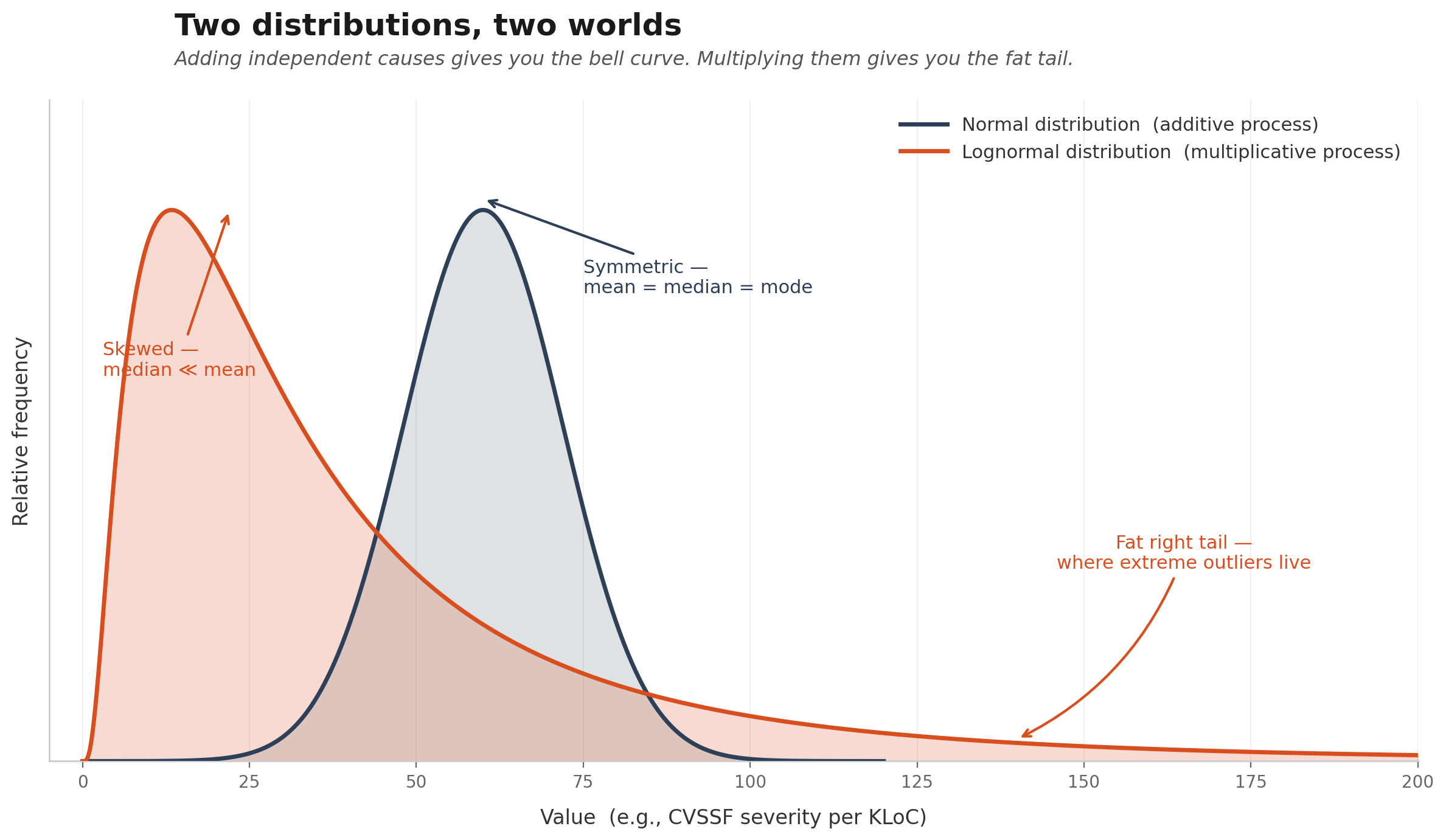
Normal distributions come from adding many independent small causes. The classical textbook example is the height of adult humans: your height is the sum of thousands of small genetic and environmental contributions, each pulling you a millimeter one way or another, and the Central Limit Theorem guarantees the sum is Normal. That’s why nobody is 15 meters tall. Additive processes have thin tails.
Lognormal distributions come from multiplying many independent factors. If X = f₁ × f₂ × f₃ × ... × fₙ, then log(X) = log(f₁) + log(f₂) + ... + log(fₙ), and that sum is what becomes Normal by the Central Limit Theorem. When you exponentiate back, you get a lognormal — with a fat right tail where a few observations can be orders of magnitude larger than the median.
This is not a statistical curiosity. Robert Mullen established the theoretical case back in 1998, in a paper called The Lognormal Distribution of Software Failure Rates: Origin and Evidence, published at ISSRE. His thesis is blunt: the lognormal distribution has its origin in the complexity of software systems — the depth of conditionals — and in the fact that event rates are determined by an essentially multiplicative process.
Mullen and Gokhale later extended this to defect repair times over more than 10,000 defects at Cisco Systems, and then to security-related defect counts specifically, where they proposed a Discrete Lognormal model. The line of evidence now spans three decades.
The intuition is this: a vulnerability doesn’t appear because of one thing going wrong. It appears when several things go wrong simultaneously. The function is too complex and the developer was junior and the code was recently churned and nobody reviewed the PR carefully and there was no SAST in the pipeline and the component happened to receive untrusted input. Each condition is a multiplier. Miss any one of them and the vulnerability probably doesn’t ship. Hit all of them and you get hacked.
When you multiply probabilities, you get lognormal. When you add costs, you get Normal. That’s the math.
The factors, named
The part of this I find most useful as an operator is not the distribution itself — it’s the identification of which factors actually do the multiplying. The literature on defect and vulnerability prediction is surprisingly specific about this. I’ll compress two decades of it into five families.
Family 1 — Code complexity. McCabe’s cyclomatic complexity, nesting depth, function size, fan-in/fan-out, CK metrics for OO systems. Shin and Williams were the first to show systematically that complexity metrics discriminate vulnerable from non-vulnerable code. Individually, the correlation is modest. Multiplicatively combined with the others, it becomes devastating.
Family 2 — Code churn. Nagappan and Ball at Microsoft Research established in ICSE 2005 that relative code churn — the proportion of lines changed to total lines, and the temporal concentration of those changes — predicts defect density with 89% accuracy on Windows Server 2003. Not how much the code changes in absolute terms. How much it changes relative to its size, and how concentrated those changes are in time. Files that mutate rapidly are files that break.
Family 3 — Developer activity. Number of developers who touched a file, concentration of authorship (your bus factor), ex-developers who left, experience in that subsystem. Meneely and Williams showed that when many developers touch a file without clear ownership, vulnerability probability spikes. This is the human version of churn: it’s not the number of hands, it’s whether any of them knew what they were doing.
Family 4 — Process maturity. Here the evidence is at organization level, which is where we live. Staron and Meding studied 61 projects in 2012 across CMMI maturity levels. Median defect density: CMMI 1 = 4.1, CMMI 3 = 3.0, CMMI 5 = 1.25. Ratio of worst to best across process types in their sample: Cowboy dev 5.8 down to Hybrid 0.7, roughly 8× difference just from process. The Software Engineering Institute reports 71% defect density reductions on average from SW-CMM to CMMI Level 5. This is the factor that most organizations underestimate the most, because nobody likes admitting that how you work matters more than who you hired.
Family 5 — Product attributes. Language (C/C++ carries vulnerability classes that Java and Python simply don’t have), project size, code age, whether the component receives untrusted input. Attack surface exposure concentrates vulnerabilities in ways that dwarf most other factors for the handful of files on the boundary.
Five families. Each one multiplicative. Each one roughly independent of the others — your CMMI level doesn’t dictate your choice of language; your team’s tenure doesn’t dictate your churn rate. Multiply four or five of these together, each contributing a factor of 2× to 3× between best-in-class and worst-in-class, and you get exactly the two orders of magnitude of spread that shows up in the data.
What this means for anyone who has to talk about security numbers
If you’re a CISO, a security vendor, a consultant, or an industry analyst, here is the operational consequence of all this, and it’s uncomfortable.
First: stop reporting means. The mean is a lie for any metric that lives on a lognormal. I see industry reports constantly saying things like “the average organization has X vulnerabilities per million lines of code.” That number is meaningless. It is dominated by the worst three or four organizations in the sample. Use the median, or better, report the full distribution with P25/P50/P75/P90.
Second: stop using standard deviations as error bars. A Gaussian confidence interval around a lognormal mean produces intervals that often include negative values — physically absurd — and that miss the actual uncertainty by a wide margin. Work in log-space, or use quantile-based intervals. If you’re comparing two organizations and their densities differ by 3×, that looks huge in linear scale but is roughly one standard deviation in log-scale. It may not even be a real difference.
Third: stop treating outliers as outliers. The organization at 1,546 CVSSF/KLoC in our data is not a data error. It’s a prediction of the model. Lognormals produce a few extreme values by construction. If you cut the top 5% because they “look anomalous,” you’re not cleaning your data — you’re censoring the exact observations that carry the most information about the tail.
Fourth: stop promising linear improvements. Moving from 200 to 100 severity per KLoC is not twice as hard as moving from 100 to 50. In log-scale, both are one stop. That’s why organizations that already have good hygiene find it so hard to improve: they’re fighting against σ_log, not against raw counts. Remediation ROI is logarithmic, not linear.
Fifth: accept that the tail is where the risk is. If 10% of your portfolio of assessed organizations concentrates 70% of the open vulnerabilities — and with σ_log = 1.77 they do, almost by definition — then your remediation strategy cannot treat all clients equally. Triage is not a preference. It’s a consequence of the shape of the distribution.
The reason I’m writing this
I’m a systems engineer who’s ended up spending a lot of time on the wrong end of bar charts. And what I keep finding is that the security industry — especially the compliance-theater segment of it — traffics in statistics that assume Normality where there is none. Dashboards with averages. Reports with standard deviations. Benchmarks that say “the industry average is X” without ever asking whether the industry average is a number anyone actually has.
The shape of severity density is not a mystery. It has a theoretical explanation that’s held for 30 years. It has five named factor families that each independently contribute to the multiplicative cascade. It has a consistent signature — fat right tail, median well below mean, σ_log around 1.5 to 2.0 — that shows up whenever someone measures it honestly.
If you are buying, selling, or reporting on AppSec, and the numbers you’re looking at don’t account for this, you are looking at an average height of organizations where three of them are blue whales.
The math does not care whether your dashboard is pretty. It cares whether your dashboard is true.
Data and model: 71 organizations assessed by Fluid Attacks. CVSSF Open Vulnerability Density per 1KLoC on applicable lines of code. Best fits: lognormal (AIC 720.3, KS p=0.85) and log-logistic (AIC 719.0, KS p=0.98), statistically indistinguishable at this sample size. Theoretical foundation: Mullen, R. E. (1998, ISSRE); Gokhale & Mullen (2010, Empirical Software Engineering 15(3)); Shin, Meneely, Williams & Osborne (2011, IEEE TSE 37(6)); Nagappan & Ball (2005, ICSE); Staron & Meding (2012, ESEM); Concas et al. (2011, IEEE TSE 37(6)).